November 14, 2025
Creating KPI Dashboards with SQL
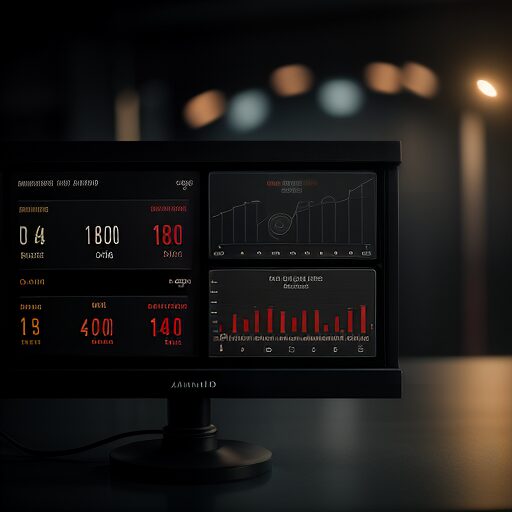
How to build a useful sales KPI dashboard in Zoho Analytics using two SQL queries — close rate by rep and year-over-year performance comparison.
A KPI dashboard is only as good as the queries behind it. This post walks through building a sales performance dashboard in Zoho Analytics using two SQL queries I wrote for a client tracking meetings, proposals, and closed deals.
Why Bother With Custom SQL
Zoho Analytics has drag-and-drop chart builders, but they hit a ceiling fast. As soon as you need year-over-year comparisons, conditional aggregations, or metrics that span multiple date fields, you're writing SQL. These two queries cover the cases that come up most often in a B2B sales context.
Query 1: Sales Close Rate by Rep (YTD)
This query answers: for each salesperson, what percentage of their opportunities this year turned into closed-won deals?
SELECT
  O.`Opportunity Owner Name` AS "Salesman",
  COUNT(O.`Id`) AS "Total Opportunities",
  SUM(
    CASE WHEN O.`Stage` = 'Closed Won' THEN 1 ELSE 0 END
  ) AS "Closed Opportunities",
  ROUND(
    SUM(CASE WHEN O.`Stage` = 'Closed Won' THEN 1 ELSE 0 END)
    / COUNT(O.`Id`) * 100,
    2
  ) AS "Close Rate (%)"
FROM `Opportunities (Zoho CRM)` AS O
WHERE (
  (
    YEAR(O.`Proposal Send Date`) = YEAR(CURDATE())
    AND O.`Proposal Send Date` >= CONCAT(YEAR(CURDATE()), '-01-01')
  ) OR (
    YEAR(O.`Created Time`) = YEAR(CURDATE())
    AND O.`Created Time` >= CONCAT(YEAR(CURDATE()), '-01-01')
  )
)
AND O.`Duplicate/Variation` <> TRUE
GROUP BY O.`Opportunity Owner Name`
ORDER BY `Salesman`
A few things worth noting:
The OR on date fields handles a real-world inconsistency — some records have a proposal send date populated, others only have a created time. The OR clause catches both rather than silently dropping records with one field null.
The duplicate filter (Duplicate/Variation <> TRUE) is essential in any CRM dataset. Without it, close rates look artificially deflated because duplicate opportunities are counted in the denominator.
Visualization: A horizontal bar chart with reps on the Y-axis and close rate % on the X-axis is easiest to scan — easier than vertical bars when rep names are long.
Query 2: YTD vs. Prior Year Sales Performance
This query answers: how does each rep's total revenue and deal count this year compare to last year?
SELECT
  O."Opportunity Owner Name" AS "Salesman",

  SUM(CASE WHEN YEAR(O."Sales Agreement Signed Date") = YEAR(CURDATE())
    THEN O."Final Sale Amount" ELSE 0 END) AS "Total Amount (Current Year)",

  SUM(CASE WHEN YEAR(O."Sales Agreement Signed Date") = YEAR(CURDATE()) - 1
    THEN O."Final Sale Amount" ELSE 0 END) AS "Total Amount (Prior Year)",

  SUM(CASE WHEN YEAR(O."Sales Agreement Signed Date") = YEAR(CURDATE())
    THEN 1 ELSE 0 END) AS "Deal Count (Current Year)",

  SUM(CASE WHEN YEAR(O."Sales Agreement Signed Date") = YEAR(CURDATE()) - 1
    THEN 1 ELSE 0 END) AS "Deal Count (Prior Year)",

  ROUND(
    (
      SUM(CASE WHEN YEAR(O."Sales Agreement Signed Date") = YEAR(CURDATE())
        THEN O."Final Sale Amount" ELSE 0 END)
      - SUM(CASE WHEN YEAR(O."Sales Agreement Signed Date") = YEAR(CURDATE()) - 1
        THEN O."Final Sale Amount" ELSE 0 END)
    )
    / NULLIF(
        SUM(CASE WHEN YEAR(O."Sales Agreement Signed Date") = YEAR(CURDATE()) - 1
          THEN O."Final Sale Amount" ELSE 0 END),
        0
      ) * 100,
    2
  ) AS "Revenue Change (%)"

FROM `Opportunities (Zoho CRM)` AS O
WHERE O."Stage" LIKE '%Won'
GROUP BY O."Opportunity Owner Name"
ORDER BY O."Opportunity Owner Name"
The NULLIF(..., 0) in the percentage change calculation is the critical detail — without it, any rep with zero prior-year revenue causes a division-by-zero error and breaks the entire query result.
Visualization: Side-by-side grouped bars for current vs. prior year revenue, with a separate widget showing the Revenue Change (%) as a signed number. Positive deltas in green, negative in red.
Dashboard Layout Tips
Once the queries are in, a few layout principles that make the dashboard actually usable:
- Put close rate at the top. It's the number management asks about most. Don't bury it.
- Keep filters global. A date range filter that only affects one chart is confusing. Wire it to all panels.
- Don't add a chart for every metric. If you can put two numbers next to each other in a summary widget, do that instead of two separate charts.
- Refresh schedule matters. A dashboard that's 24 hours stale during a sales push is worse than no dashboard — it creates false confidence. Set your data source sync accordingly.